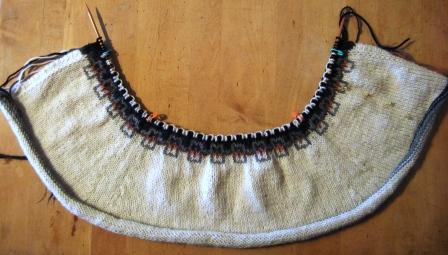
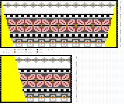
 Here we are again — and believe it or not, progress is being made. We are up to the Fair Isle panel, which is the most complex part of the whole thing. Keep breathing.
There are a couple of things we need to address here. One is the yarn substitutions I made — i.e. the color changes — and the other is the shaping.
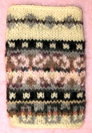
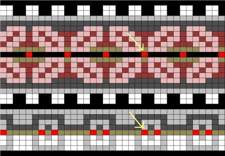
Here’s my original swatch for the FI panel. Just about everything looks pretty good, color-wise, except for the main motif section between the black & white checks.
You’ll notice that the bottom half of it is a muddy mess, while the top half of it is a bit clearer. This is due to the big color change I made when I chose the yarn: I changed the rose pink color that was called for in the original to a pale pink MOHAIR.
The bottom half of this motif is knitted according to the original chart, but with the new colors, and as you can see I’ve really screwed up the contrasts with that color change. Bleah.
The top half I knit with a background of solid taupe, which contrasts much better with the pink MOHAIR.
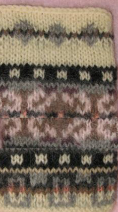
Using the "magic" of Photoshop, let’s take a look at what we can expect if we use the second approach on the whole motif —
Not too bad, but maybe a bit boring.
It looks like the taupe, the dark raspberry, and the charcoal colors will all contrast well with the pale pink. We should be able to do something with that. Since I already know I’m going to have to do a lot of futzing with the chart for the shaping anyway, I’ve duplicated the chart in Excel, and there I will be able to play around with the colors. But there’s some grunge work to do before we get to that part.
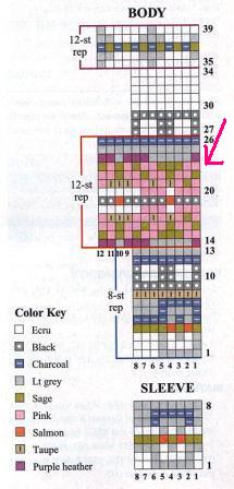
The first thing I had to fix was the alignment of the 8-st repeats with the 12-st repeats. Of course you can’t line them up perfectly, because the repeats have different numbers of sts — but you can do better than what was published.
In the original chart, the (fairly obvious) salmon dots are aligned such that the single dot of the main motif is placed directly above one of the dots in the pair below. This misaligns the centers of the two patterns by one stinkin’ stitch. To my eye, in such a geometric pattern, this is a decidedly jarring note.
In my chart, I started by looking at just one repeat. I took the salmon dot of the large motif, and centered it with respect to the pairs of salmon dots in the small motifs. When the repeats are expanded, this results in the two major motifs being centered and balanced with respect to each other overall.
It is also worth noting here that the 4-st black & white checker pattern really can’t be lined up properly with either the 12-st or the 8-st motifs. This is because the 12-st motif is really more of a "multiple of 12 + 1" and the 8-st motif is similar, while the 4-st motif is not.
BTW, I’m sure there is a technical word for this concept, and I’d love to know what it is. But, the best I can do is explain it like this: the 12-st and 8-st motifs are symmetrical about a central st, while the 4-st repeat is symmetrical about a line drawn between sts.
So, this 4-st checker motif basically is gonna get ignored, as far as centering it up with anything else goes.
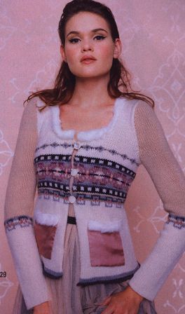
The next thing I had to do is center the charts with respect to the garment. If you look at the main motif on the front of the sweater in the magazine picture, it is totally cockeyed with respect to the garment’s center front. Originally, I wasn’t sure if this was due to the charts being cockeyed, or just due to the front edges of the sweater rolling under.
This violates such a basic rule of good design that it leaves me speechless. Anyone who has ever even WORN a cardigan ought to understand the concept of CENTER front. For crying out loud. This is – or should be – a genuine embarrassment to Vogue Knitting. It will probably end up being embarrassing to the knitter, as well:
"Oh, did you make that yourself, honey?"
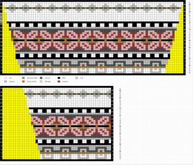
Ahem. Obviously, I want my sweater to have a full "X" motif on either side of center front. Additionally, I decided to include the single st that separates the main motifs right at the center front as a kind of margin or border. Look at the second of my two charts: the right side of the chart is center front, and you’ll see that there is a single st followed by a full motif. Doesn’t that look a whole lot better? Yes, it does.
As for the garment back: because of that "multiple of 12 + 1" thing, in order to center the two main motifs with respect to the center back of the garment, I end up having to add 1 to the st count on the back.
OK! Now that THAT’s settled, I can pull out my trusty spreadsheet (see the previous post) and work on the shaping.
- We want 5.5" from waist to bust, and at 6.75 rows per inch, that’s about 37 rows or so. The armhole starts at row 90, so we have to be done by then. The waist is at row 51, but the chart actually starts at row 49, so I’m calling it 90 – 49 = 41 rows to work with.
- We want to increase from 128 sts to 160 sts, or 32 sts.
- We will gain 4 sts on every inc row, so that’s easy: 32 / 4 = 8 increase rows.
The classic method of calculating frequency of increases is to take the number of increase rows we need (8), add 1 to it (9), and then divide our number of rows by that:
- 41 / 9 = every 4.5 rows.
We want to keep the inc rows separated by an even number of rows, so we don’t have to inc on WS rows. Unfortunately for me, this isn’t really close enough to a nice even number to work out well.
If we play with the numbers a bit, and figure we won’t start the shaping until row 51 (or even a bit later), what does that do for us?
- 90 – 51 = 39 rows to work with.
- 39 / 9 = every 4.3 rows.
Well, we’re getting closer to an even number. BUT — be aware that what the "adding one" thing does, is to give us a sort of "margin" of a couple of rows before and after the shaping starts — and now we are adding even more "margin".
So, if we’re going to play this game, we need to forget about the "add one" bit.
- 39 / 8 = every 4.875 rows, which is pretty close to 5.
Cool. We’ll take it.
Yes, I know I said we were looking for an even number of rows. In this case, we will end up doing one inc row after 4 rows and one after 6 rows, which is an average of every 5 rows. (Didn’t you always wonder where the heck that kind of thing came from in knitting patterns? Now you know.)
So, we go back to the lovable spreadsheet, and plug in our inc rows every 4th and 6th rows in the FI section. I also go back to the chart and block out (in yellow) what that’s going to look like, as a double check. It gets a little hairy due to that stupid 4-st checker repeat. I will have to have 3 black or 3 white sts in a row somewhere (or 1 white st or 1 black st), since I had to have an odd number of sts on the back.
But, this little inconsistency is so minor compared to the rest of this thing, I feel like it’s not worth losing sleep over. I’ll put it at the left side seam, at least, where I hope it may even be somewhat inconspicuous. Don’t tell the State Fair judges. I’m trusting you on this.
Oh, yes. I need to mention how I’m going to do these increases. Well, I want them to be as invisible as possible, so I’m going to do them right at the side seam markers: one immediately before the marker and one immediately after. And I’m going to use what are generally known as "lifted" increases, in pairs: first a left, before the marker; then a right, after the marker.
Lifted knit increase, right (on a knit row, and the new stitch will be to the right of the original): before you knit the next stitch, look at the purl side of the work, and use the right needle to pick up the top loop of the stitch that is below the next stitch on the left needle. Put this loop on the left needle, in correct st orientation (right leg of the loop to the front), and knit it. The resulting new stitch will be to the right of the original stitch.
Lastly, I played with the background colors in the main motif until I came up with something I liked. As a double-check, I removed the cell borders and zoomed out enough to get an idea of what it would look like from a distance.
Looking gooooood….
